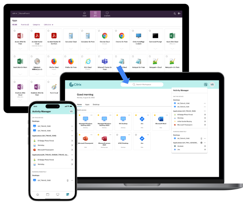
Late last year, Citrix announced the launch of a new cloud-based user interface. Citrix announced the tech preview with StoreFront 2311 CR and subsequent versions marking a significant step forward in providing a consistent experience across both cloud and on-premises environments. Available now in technical preview, this UI revamp is set to redefine how users interact with Citrix apps and desktops, enhancing simplicity, functionality, and overall user satisfaction.
The image below showcases the transition from the previous Citrix StoreFront UI to the enhanced Citrix user experience.
Enabling the New User Experience
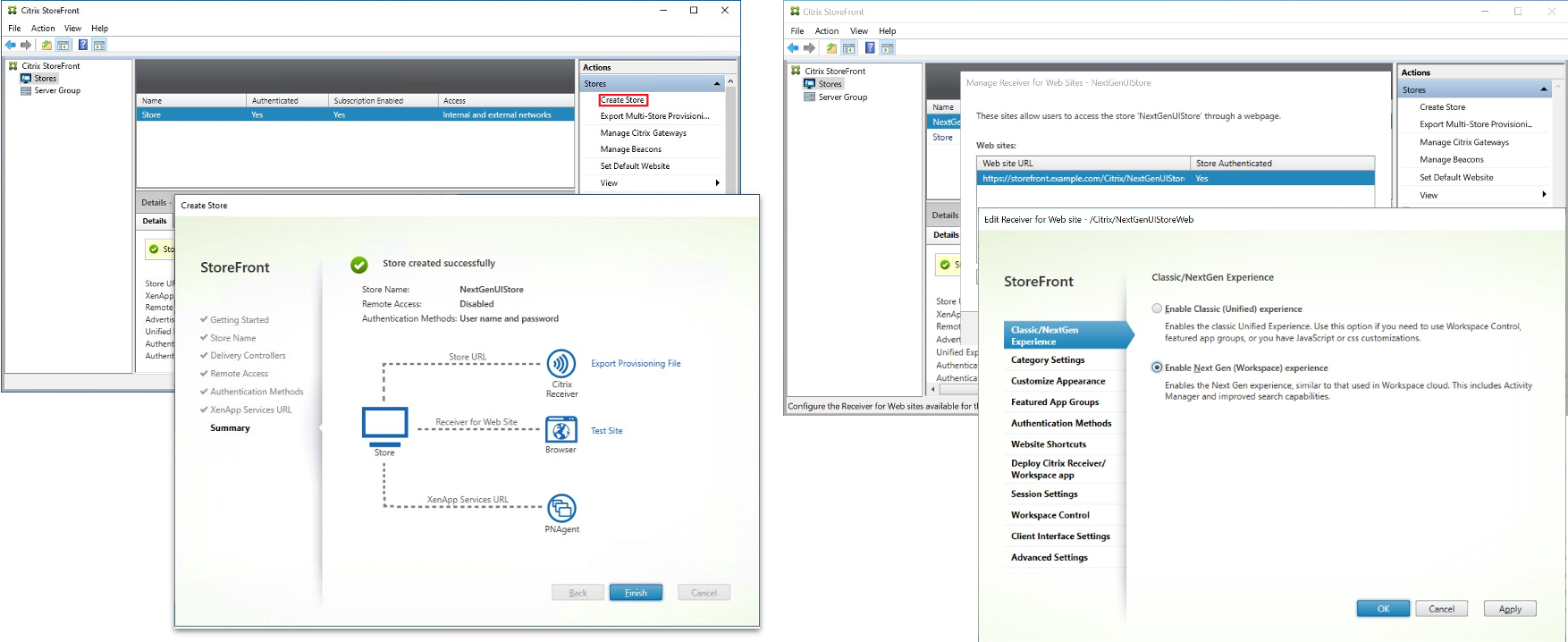
For those eager to test out the new UI, you should upgrade to StoreFront 2311 and later. Creating a new store and enabling the experience are the first steps. This approach allows for thorough testing with a limited user base, ensuring a seamless transition for all. After the store is created, head to “Manage Receiver for Website” and click “Configure.” Under “Classic/Next-Gen Experience,” select “Enable Next-Gen Experience” as shown in the screenshots below.
Key Benefits of the New UI
User-Friendly Interface:
With a focus on reducing visual complexity and providing easy access to essential features, the new UI streamlines the user experience, making navigation a breeze. From intuitive navigation to personalized favorites, the new UI offers a revamped layout designed to enhance productivity and user engagement.
- Simple View: Users with fewer than 20 apps are presented with a streamlined view that combines all apps and desktops onto a single page. This view does not include tabs or categories, making navigation straightforward. Apps marked as favorites are prioritized at the beginning of the list, followed by the rest in alphabetical order.
- Home Page: Users with more than 20 apps are directed to the Home page upon sign-in. This page allows the ability to favorite apps and showcases up to five most recently used apps and desktops for quick retrieval. Additionally, apps mandated by admins are prominently marked with a star icon, indicating their importance. Users cannot remove these apps from their favorites list.
- Apps Page: If the admin has not enabled the home page, users are directed to the Apps page. Here, favorite apps are listed first, followed by all other apps in alphabetical order. If app categories are created by the admin, users can click on these categories to locate specific apps more efficiently.
- The Desktops tab offers quick access to virtual desktops, organized similarly to the Apps page, with favorites at the top for efficient navigation.
Categorization of Apps:
Say goodbye to cluttered interfaces. The new UI improves the multi-level folder structures that adapt to the user’s screen size, ensuring a clutter-free experience that enhances overall satisfaction.
- Across industries such as education and manufacturing, organizing applications into intuitive categories streamlines workflows and enhances user productivity.
- For example, in an IT organization managing a diverse range of applications, categorizing apps based on deployment environments allows administrators to segregate production-ready applications from those in development or testing phases.
- Similarly, in a multinational corporation with geographically dispersed server infrastructure, categorizing apps based on regions and server locations facilitates efficient resource allocation and load balancing
Activity Manager:
A game-changer in resource management, the Activity Manager empowers users to take quick actions on active virtual apps and desktops, optimizing performance and efficiency.
By providing users with visibility and control over active sessions, it transforms how resources are managed.
- From disconnecting sessions to shutting down desktops, users can take action with ease, reducing help desk tickets and optimizing resource utilization.
- In the healthcare and financial sectors, the Activity Manager optimizes virtual desktop session management. Healthcare professionals and clinicians rely on virtual desktop sessions for accessing patient records and medical apps. With the Activity Manager, they can swiftly disconnect between patients or shut down desktops post-rounds, ensuring patient data security and enhancing workflow efficiency while meeting privacy regulations.
- Similarly, in financial institutions, employees can log out or shut down desktops promptly, reducing unauthorized access to sensitive data and aligning with regulatory requirements.
Improved Search Capabilities:
Finding what you need is now faster and more intuitive than ever. Displays Recently Used Apps Automatically, saving time by showing recently used apps before typing anything. Instant Search Results show up immediately upon typing the first alphabet, eliminating the need to type three letters before displaying results. Fuzzy Search provides results with the closest match to the typed text, even with spelling mistakes, enhancing search accuracy.
What is in the pipeline
Instantaneous UI Rendering: We understand the value of time in the digital workspace. To further optimize user experiences, we are parallelizing many startup processes, including bridge setup and authentication handshakes. This enhancement aims to render the UI within milliseconds, significantly reducing the current 3~5 seconds spinner delay.
Activity Manager – Hibernate and resume: Users can hibernate active or disconnected sessions in the Activity Manager if the underlying desktop has the capability Upon selecting the ‘Hibernate’ action, users are informed of the benefits, such as energy savings and session state retention, with a progress indicator displayed during hibernation. In-Hibernation sessions are segregated in the Activity Manager. Users can resume these sessions from the activity manager
Enhanced Search Results: Search results will now include categories. This empowers users to distinguish between different apps belonging to various categories. The search results will feature a convenient dropdown menu, enabling users to take further actions like favoriting and accessing app descriptions.
Try it today!
The new UI is available to try today and offer your valuable feedback. Your insights are crucial in shaping our platform’s evolution and ensuring it meets your needs effectively.
Additionally, we’d love to hear about any customizations you’re actively using. This information will help us explore options to provide some of them out of the box, simplifying your experience and enhancing usability. You can share your feedback and customization details through our Podio form here.
In conclusion, the new UI for on-premises stores represents a significant leap forward in Citrix’s commitment to delivering innovative solutions that meet the evolving needs of users. With its user-friendly interface, enhanced functionality, and customization options, the new UI is poised to redefine how users interact with Citrix apps and desktops. Try it today!


