In our journey toward a new and modern user interface (UI) we have simplified the user experience to make it more intuitive, while retaining the features you love and improving the navigation to apps and desktops. Many of you may have read my previous blog on the new UI tech preview where I explained all the features we have modified and the new features we have introduced to improve user experience. Based on the feedback from the Tech Preview, we implemented some critical features and addressed some important admin requests before general availability, which you can read more about in the general availability announcement blog.
Even over the course of this month, we are still implementing new capabilities to make your transition to the new UI easier. In this blog, we’ll go over the enhancements we’ve made in the new Citrix interface and how to transition your users over.
We understand that your user base is accustomed to the current user experience. We have kept this especially in mind while designing the new UI, so that it is intuitive for users to switch from the old experience to the new one. We understand that switching to the new user interface will require training and documentation for admins, so we’re giving you six months to prepare for the transition to the new user interface. Once you are ready to transition, you can migrate users to the new UI based on user groups or regions.
To help with this transition, we have introduced “coach marks” in the UI. These are pop-up messages to help a user better interact with the UI. When a user sees the new UI for the first time, they will be greeted with a welcome message and then they will follow a guided tour of what each component is and how the UI has changed. And in case you are still curious about the benefits of transitioning to the new UI, you can enable the UI for a small number of users to test it out in your environment.
The animation below showcases some of the coach marks a user would see.

New features in the Citrix UI
We are continuing to make enhancements based on your feedback. This includes adding back the description field so that you can read the description of apps and desktops by going to the menu on each app and desktop tile. You can use the description to distinguish between apps with the same name but different deployment configurations which include geolocation, production vs UAT environment, and more.
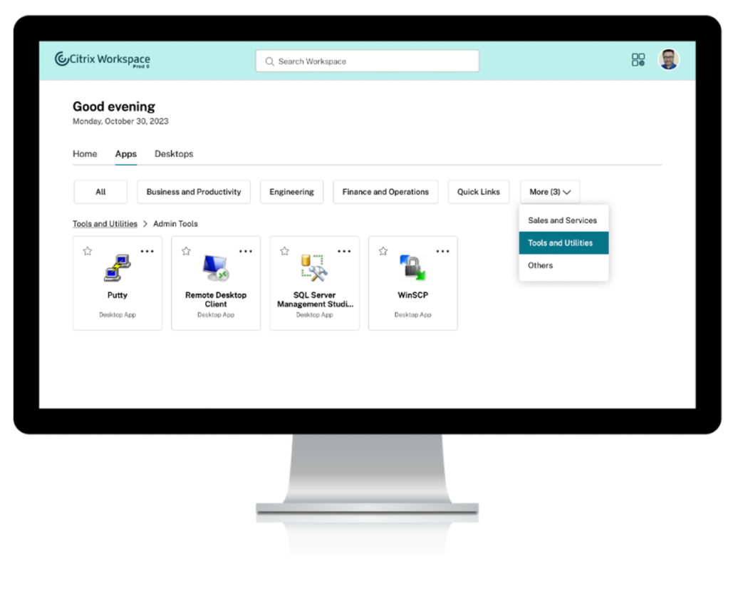
Additionally, we have made significant improvements to how categories are displayed and made it scalable, so that even if you have hundreds of categories, apps and desktops will be easy to access. App and desktop categories will be on the top of the screen and arranged in alphabetical order. When the number of categories goes beyond the first row, they are folded under a “more” button at the end which can be clicked to reveal the rest of the categories. If you use subcategories to further structure your applications into different folders, you can now see those in the new UI as well. We have kept the subcategory behavior similar to the current one so that users will have a similar experience navigating across subcategories. Subcategories will appear as folders when you click the root folder on the top. As you drill down, you will see the category path at the top to show the folder structure you are in at any point. Users can click on the path to easily navigate back to previous folders. You can have any number of categories and subcategories with this type of structure.

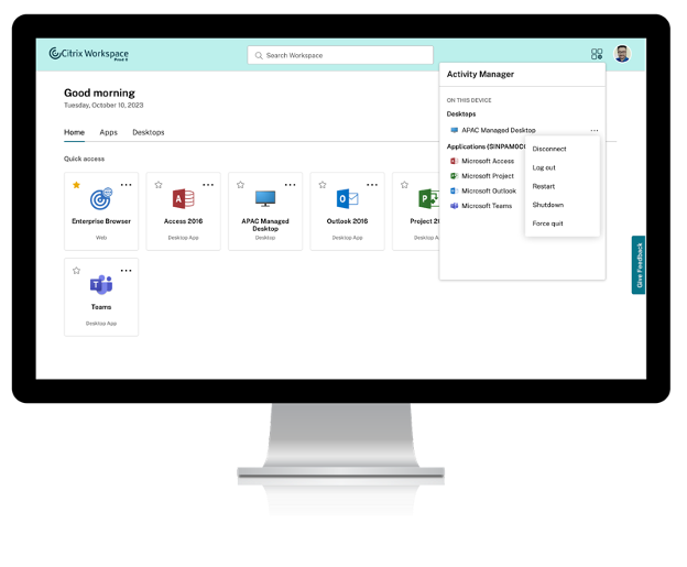
Let’s get to the star of the show: Activity Manager. Now, users can see disconnected app and desktop sessions alongside connected ones. We heard your feedback that this feature will help you take action to fix disconnected sessions and save help desk personnel time and money. We have added power management capabilities to the Activity Manager as well. If your users have persistent or dedicated virtual machines, they will be able to see three more options under the three dot menu: Shutdown, Restart, and Force Quit. Users can utilize shutdown to turn off their machines. This will log off the user and then close the machine to reduce total power consumption. Restart will shutdown the machine and then relaunch. Force quit will turn the virtual machine (VM) completely off when the VM is not responding to shutdown. This is a hard power down which will abruptly turn off your machine. One thing to note is that the above power management options will only be available if admins have configured power management capabilities for end users. You can learn more about Activity Manager here.

Transitioning to the new Citrix UI
You can enable all of these features for end users from the ”Features” tab in Workspace Configuration in the Citrix Cloud console. The current default is the old UI. You can enable the new UI for a few users, or the entire user base, using the domain selection and user selection in the ”Features” tab. After carefully discussing with administrators, the Citrix user group community, and Citrix technical advisors, you will have 6 months to prepare for the transition and move your users to the new user experience. After 6 months, in March 2024, the old UI will be retired.
During this transition, we will continue to work on bridging feature gaps. We are constantly upgrading the features in the UI without any change to user workflows. Some of the features we are working on include: making local app termination from Activity Manager directly, providing a one click reconnect to disconnected apps and desktops, and session handoff from one device to another. Along with existing power management capabilities, we also plan to add hibernate and resume on persistent machines to conserve energy and reduce costs. In order to take advantage of all these new features, you’ll need to implement the new Citrix UI.
What’s next for UI improvements?
As we roll out all these new features, we’re continuing our focus on improving the new UI as well as improving the on-premises StoreFront experience. Be sure to transition to the new Citrix UI! You can find out more on our product docs. Stay tuned for more information about these exciting features which are in the pipeline and are yet to come.
Disclaimer: This publication may include references to the planned testing, release and/or availability of Cloud Software Group, Inc. products and services. The information provided in this publication is for informational purposes only, its contents are subject to change without notice, and it should not be relied on in making a purchasing decision. The information is not a commitment, promise or legal obligation to deliver any material, code, or functionality. The development, release, and timing of any features or functionality described for products remains at the sole discretion of Cloud Software Group, Inc.


