Citrix has seen a lot of change over the years, but what I’ve loved about 2023 so far is our enhanced commitment to getting back to basics and doing what Citrix does best. We deliver secure high-performing apps and desktops to all of your users regardless of location, device, or network connection. Simple, right? But simple is the new sophisticated, and we are in constant pursuit to deliver the best experience to your users while meeting you where you are in your deployment journey.
We introduced our new Citrix initiatives earlier this year with our Destination: Hybrid event, a strategy that came from listening to our customers. You told us that hybrid cloud is actually the destination for your organizations, not just a pit stop on the way to cloud. We have been delivering new functionality across both cloud and on-prem, significantly increasing our investments in innovation, to drive IT flexibility and choice. It’s your decision to choose how to best configure your environments for your business needs. We’re here to help.
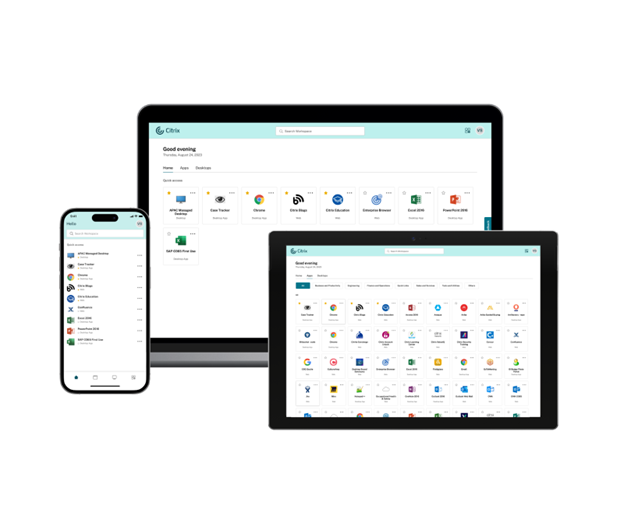
And of course, Citrix has always believed that the success of IT begins and ends with user experience and that isn’t just about our market-leading HDX technologies — it starts from the moment an end-user opens our client app. We have been working toward delivering the next generation of the Citrix experience. Today, after several months of taking your design input and testing with end users, I’m thrilled to announce the release of our new UI! This next generation of the interface is laser-focused on app and desktop delivery, enables users to quickly get to the resources they need without distraction, and offers users more autonomy with self-service. (And don’t worry — while this initial release integrates with our cloud DaaS solution, it will support on-prem StoreFront users really soon!)
But don’t take my word for it. Let’s look at the new interface in action:
To view even more of our latest Citrix features in action, subscribe to the Citrix YouTube channel.
The new UI is refocused strictly on secure app and desktop delivery. The new interface is built to deliver users the exact web, SaaS, Linux, or Windows apps and desktops they need securely from wherever they are.
Get more from less
Simplified and customizable are the words to describe our revamped interface. When chatting with customers, we often hear that admins want more control of their environments, while users want fast and intuitive access to their business-critical resources. To accomplish this, we simplified the look and feel of user access and also added the ability for admins to customize the UI and deliver more options to users.
Highlighting our simplification, when users launch Citrix, they are now greeted with a quick access homepage to apps and desktops. Favorite apps and desktops can be added to the homepage to prevent unnecessary clicking and save time. We have also added app categories and improved the search functionality to help users quickly find and launch their apps and desktops. And importantly, if users only have a handful of apps and desktops delivered to them, the interface automatically aggregates all their resources onto a single page to prevent users from having to go to multiple tabs. This is all great news for both first-time users and Citrix veterans.

Now let’s look at how we have brought more customization. You now have the ability to provide multiple URLs to allow for one interface to access multiple stores. You can even put your own branding all over, so it welcomes users with familiar logos and colors. This truly is your digital workspace!
One of the most exciting additions to the new interface is the Activity Manager, something that our customers inspired. This panel gives users a quick look at the apps and desktops they have running. It’s not only great for visibility, but users are also able to shut down and log off from virtual sessions directly from the panel. The Activity Manager empowers users to manage their sessions and in turn, reduces help desk tickets and associated costs. Additionally, this tool highlights disconnected sessions which enables admins to empower users to be more energy conscious as discussed here. We took a deeper look at the new Activity Manager and what it can offer you in this blog.
The screenshot below highlights the new user interface with the Activity Manager selected.

Try it today
To learn more about the new user interface and see how to start testing it, please visit our product documentation. Then you can activate this new experience from the Citrix cloud console, and you can activate it for a few groups of users at a time to get them acclimated. And remember, while this is in cloud at first, we are as committed to on-premises as ever, so keep an eye on our blogs!
This is just one of the many ways that we have been modernizing and streamlining the Citrix platform, and just one of the many things we have been collaborating with our customers on developing. With our renewed focus and dedicated product teams, there’s so much more to come and I can’t wait to make more announcements like this one.
Disclaimer: The development, release and timing of any features or functionality described for our products remains at our sole discretion and are subject to change without notice or consultation. The information provided is for informational purposes only and is not a commitment, promise or legal obligation to deliver any material, code or functionality and should not be relied upon in making purchasing decisions or incorporated into any contract.


