With the release of Storefront 3, we have a few customization options for branding within the Storefront MMC, but a more robust method of customization through CSS.
This example will take a vanilla site from Storefront 3 and brand it according to requirements for “LabCorp”. The intention of this article is to demonstrate the customization architecture for Storefront 3.
First, let’s look at what we can customize using the Storefront MMC:
We have options to add a logo to the logon page and the post-logon page, as well as setting some colors on the post-logon page.
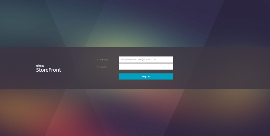
Let’s look at the original experience before we make modifications. Here is the logon screen:
Favorites:
Desktops:
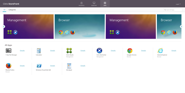
And lastly, Apps:
In this example, I am going to brand Storefront to “LabCorp” whose appearance dictates a dark-themed cityscape with high visibility text.
First, let’s get the logo uploaded. I have a 340×120 logo in PNG format with transparent background I want to upload. While in the same dialog, I’m going to change the top bar to be a darker color, and also make text highly visible yellow, with links as a web default blue color.
What happens when I press OK here is a little magic in a folder you will get very familiar with.
C:\inetpub\wwwroot\Citrix\<storename>Web\custom
Browsing to this folder, I can see that the labcorp.png file is now there, and the style.css file timestamp changed.
All (well, most) customizations to the site’s appearance will take place in this folder.
If we look at the Style.css file in an editor, we can see the following modifications were made in the managed code section:
<strong>/* The following section of the file is reserved for use by StoreFront. */</strong>
<strong>/* CITRIX DISCLAIMER: START OF MANAGED SECTION. PLEASE DO NOT EDIT ANY STYLE IN THIS SECTION */</strong>
.theme-header-bgcolor {
background-color:#424242;
}
.theme-header-color {
color:#FFFA00;
}
.theme-highlight-color {
color:#231ED6;
}
.is-hdpi .logo-container{
background-image: url('labcorp.png');
background-size: 340px 120px;
}
.logo-container{
background-image: url('Citrix_HalfHeaderLogo.png');
background-size: 170px 60px;
}
.is-hdpi .logon-logo-container{
background-image: url('labcorp.png');
background-size: 340px 120px;
}
.logon-logo-container{
background-image: url('Citrix_HalfLogonLogo.png');
background-size: 170px 60px;
}
Our logon page and post-logon page have a slightly different look now:
While this is now branded and slightly different, it is nowhere near the final requirements for the site. It isn’t dark-themed at all, and a cityscape is nowhere to be found. Here’s where our Style.css file comes into more use. Whenever Storefront 3 renders a page for the browser client, it considers CSS in the custom folder last, so any changes will be the final word in the page’s appearance. This allows us to modify a number of appearance properties easily, and in one place.
Let’s get that cityscape image up!
In all examples, I utilize the developer tools natively in Chrome (CTRL+SHIFT+I), or any other modern browser. After opening the Developer Tools, find the magnifying glass (to the top left in Chrome), click it, hover over the element on the page you want to inspect, and then click one last time. All properties for that element show in the right pane.
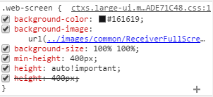
The logon screen has a large background image that we can inspect to find contained in the “background-image” property below:
This referenced image shown below is 2560x1600px and standard 72dpi for web. I’ll use the same properties of this image, but a different image. Use your favorite image editor to get your planned image to spec.
Once you have your image to use as a background, copy it to the custom folder mentioned previously:
C:\inetpub\wwwroot\Citrix\<storename>Web\custom
Open up Stlye.css and locate the following section:
<strong>/* CITRIX DISCLAIMER: END OF MANAGED SECTION. */</strong>
<strong>/* You may add custom styles below this line. */</strong>
All future CSS changes will take place below these lines of code within Style.css. DO NOT enter anything above these lines. Also, do not use commenting in the lines below this section. I found that this can cause a parse error within the Storefront MMC. Purely CSS going forward!
I’m adding the following line to utilize a picture called “Cityscape.jpg” which I placed in the custom folder.
.web-screen {
background-image: url(./Cityscape.jpg);
}
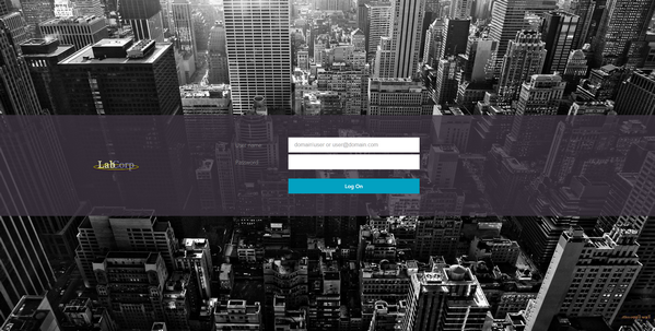
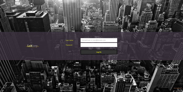
Save Style.css, and refresh your browser. Wow – that looks much more like the requirements:
Unfortunately, the user name and password labels are not that visible anymore, and the button color doesn’t match our theme very well.
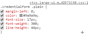
Let’s inspect the “User Name” label and the “Log On” button using our developer tools:
*TIP* This color picker can assist with your CSS color code:
http://www.w3schools.com/tags/ref_colorpicker.asp
The button properties are a little plain for my taste, so I would like to also add a border for style. Add the following code in Style.css:
 .button.default{
background-color: #333333;
color: #FFFF00;
border-style: solid;
border-color: #000000;
border-width: 4px;
}
.credentialform .plain{
color: #FFFF00;
}
That looks much better! Now, let’s move on to the “Post-Logon” portion.
I want to keep this Cityscape theme going, but we’ll maintain it at the top. I took a slice out of the logon picture and reduced brightness and contrast so we have a less intrusive picture on the top bar. I called this image “Cityscapecrop.jpg” and made it 2560x80px @ 72dpi. This file is now also in the custom folder.
Inspecting the header of the page, I can find the following CSS tags:
Since I want to add an image rather than modify a color, I’ll add the following CSS code to Style.css:
.theme-header-bgcolor{
background-image: url(Cityscapecrop.jpg);
}
Next is to rid the page of all the white space. We want dark! Using developer tools, I can find the following CSS tags and modify the properties as I want them:
.scrollable.storeViewSection{
background-color:#000000;
color:#AAAAAA;
}
.appInfoView.scrollable{
background-color:#000000;
color:#AAAAAA;
}
.toolbar {
background-color:#333333;
}
Getting there, but now I can’t read the application names. Find our CSS tags for the application name text and add the mods to Style.css:
.largeTiles .storeapp .storeapp-name{
color:#FFFF00;
}
.appInfoName {
color:#999999;
}
Much better!
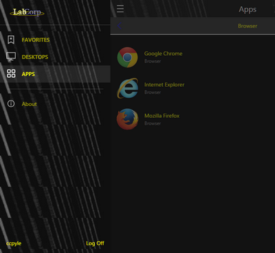
The last item to fix is only on one page – “Apps”
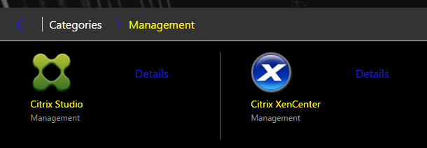
The top left nav links are blue, which isn’t exactly what I wanted.
*NOTE* – The blue color of the links and folders stem from the “Content Branding (Post Logon): Link Color” attribute configured via GUI previously.
A little more CSS in Style.css:
.theme-highlight-hover-color:hover {
color:#FFFF00;
}
.theme-highlight-border-color {
color:#FFFFFF;
}
.large .toolbar-button.current-folder {
color:#FFFA00;
}
Very nice! Selected is white, and hovered is yellow. Current folder is also yellow.
At this point, we’re done, right? Almost….
Storefront 3 also serves mobile devices and selects the look based on the client accessing the site. Does that mean we have to grab a mobile device now and somehow parse the CSS in order to modify that page, too? Nope! There’s an easy way to do this.
In your storefront URL, append “?-ph”. Example: http://SF3.domain.com/Citrix/StoreWeb/?-ph
We can now see the mobile view and find the places that we haven’t touched by editing the larger page’s CSS.
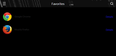
Where did our app names go? They are barely visible. This CSS tag is a little long:
.smallTiles .storeapp-name, .smallTiles .ruler-container, .smallTiles .myapps-ruler-container, .smallTiles .breadcrumb-ruler-container, .smallTiles .folder-ruler-container {
color:#FFFF00;
}
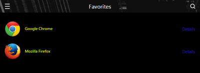
Problem Solved. Now to look at the “All Apps” page. The upper menu of “All” or “Categories” is difficult to read with the unselected font color black. What if we make the selected font color yellow, and the unselected font color a light grey?
.small .phone-toolbar-button.selected span{
color:#FFFF00;
}
.small .toolbar-button-unselected span {
color:#BBBBBB;
}
One more part for the browsing of categories:
.small .store-view .folder-tree .folder-toolbar-phone-content{
color:#FFFF00;
}
Much better.
Our last nagging problem….that side bar:
We made a nice graphic for the top to maintain our cityscape theme, but now it’s repeating on the side menu of the mobile view.
Maybe there is something in CSS that distinguishes these panes as being mobile, and we can modify the look only on mobile views.
Inspecting the entire side pane shows me a parent CSS tag for the entire side menu. If we simply override the background image and set it to none, we should get our previously selected header color.
.small .side-menu{
background-image:none;
}
Perfect!
Hopefully this example gave insight into how you can customize your Storefront deployment. To summarize, here are the main points of this How-To:
- We have a few customizable options within the Storefront MMC
- Robust customization is through use of the Style.css file in the “custom” folder within your Storefront Web deployment.
- Developer tools in Chrome, Firefox, IE, or your favorite browser assist in identifying particular CSS elements to modify.
- We have URL appends to help troubleshoot the appearance of your Storefront for Web site:
?-nocustom (no customizations)
?-ph (view mobile)
?-tr (tracing – requires pop-ups)
Additional Resources:


