 This post is a ‘cookbook’ of customization queries and requests that I’ve had since the release of StoreFront 3.0, together with some worked examples. Hope it is useful!
For each question, I’ve provided some explaination together with some javascript and/or css examples. The javascript should always be added to the custom\script.js file – for example C:\inetpub\wwwroot\Citrix\PurpleWeb\custom; and the css should always be added to the style.css file in the same directory.
How do I add a static header to the login page in Receiver for Web?
Static text here means something like a welcome message, or a company name. For something that changes, such as a news message or server status, use the dynamic example below.
For simple text try the following javascript: This sets 4 lines of text, delete the lines you don’t want
$('.customAuthHeader').html("Example one - top of login screen");

$('.customAuthTop').html("Example two - above login box");

$('.customAuthBottom').html("Example three - below login box");

$('.customAuthFooter').html("Example four - bottom of login screen");
To make them more obvious, add the following styling to custom.css
.customAuthHeader,
.customAuthFooter,
.customAuthTop,
.customAuthBottom
{
 font-size:16px;
 color:yellow;
 text-align: center;
}
Here is the rather striking result:
If you want to use html, rather than plain text that is just fine too. For example replace the four lines in script.js with theses:
$(‘.customAuthHeader’).html(“<b>Example one</b> – top of login screen”);
$(‘.customAuthTop’).html(“<div style=’background:black’>Example two – above login box</div>”);
$(‘.customAuthBottom’).html(“<i>Example three – below login box</i>”);
$(‘.customAuthFooter’).html(“<img src=’logo.png’>Example four – bottom of login screen”);
(The fourth example needs an image called logo.png in the custom directory).
How do I add a dynamic header to the login page in Receiver for Web?
By dynamic, we mean some content that is loaded and displayed every time, rather than being cached. Web browsers like to cache things when they can, but native receivers always cache the UI, and always load the previously cached UI. That means if you use the above example for something like service status you will not get what you intended.
Instead we need to do an ajax call to dynamically load the content and insert it into the page. This is easier than it sounds.
First, we define a useful utility function to fetch the content from a page in the \customweb directory on the server, and to add it to the page. This does the equivalent of our .html examples above, and the custom page can contain text, or a HTML snippet. We use the \customweb directory because it gets copied across all servers in a cluster (just like the \custom directory) but it doesn’t get downloaded and cached.
Then we arrange for this to be called at a suitable point. If we call too soon, then this can cause problems in native receivers, because the script runs before the configuration has been fully loaded. A good time for this sort of action is beforeDisplayHomeScreen (but if you want to display content on the login page, then use beforeLogin instead). The code below copes with both cases, and is suitable for web and native clients.
The full script is as follows:
function setDynamicContent(txtFile, element) {
   CTXS.ExtensionAPI.proxyRequest({
      url: "customweb/"+txtFile,
      success: function(txt) {$(element).html(txt);}});
}

var fetchedContent=false;
function doFetchContent(callback)
{
  if(!fetchedContent) {
    fetchedContent = true;
    setDynamicContent("ReadMe.txt", "#customScrollTop");
  }
  callback();
}

CTXS.Extensions.beforeDisplayHomeScreen = doFetchContent;
CTXS.Extensions.beforeLogon = doFetchContent;
This loads content from \customweb\readme.txt, which by default contains some uninteresting information. Add your own file (status.txt) and adjust the script to call this for more pleasing results.
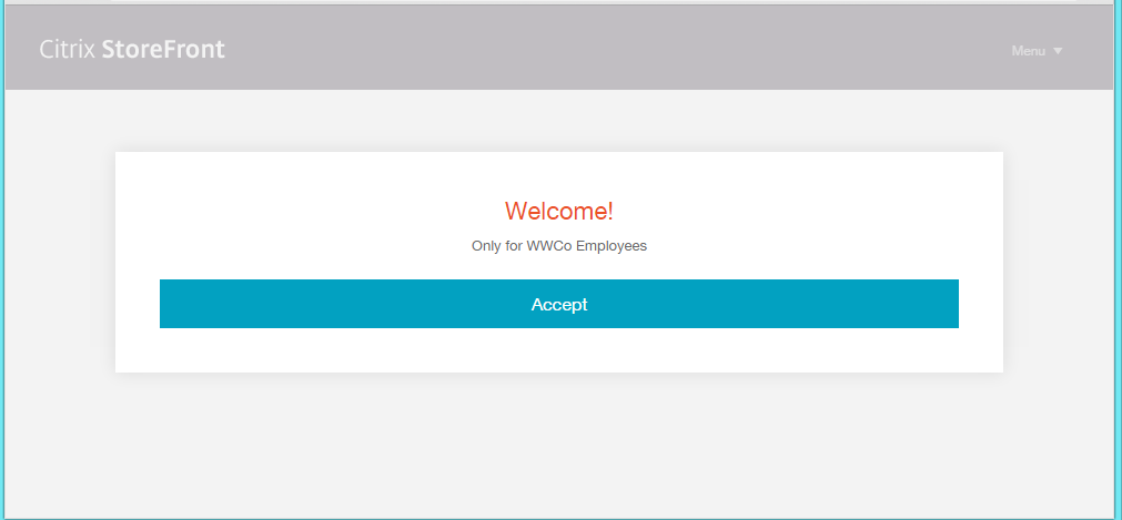
How do I show a click-through disclaimer before or after login?
This example is actually provided in the script.js file as an example. Just uncomment it. There are two versions of this code – the first is done pre-login for web browsers, and the second pre-main UI for native clients. If you only want a post-login message, just delete the first function. However just having a pre-login message isn’t a good option, as the login flow is only seen on web browsers (not native clients) and even then isn’t shown if the user is accessing from NetScaler gateway.
var doneClickThrough = false;

// Before web login
CTXS.Extensions.beforeLogon = function (callback) {
  doneClickThrough = true;
  CTXS.ExtensionAPI.showMessage({
    messageTitle: "Welcome!",
    messageText: "Only for WWCo Employees",
    okButtonText: "Accept",
    okAction: callback
  });
};

// Before main screen (both web and native)
CTXS.Extensions.beforeDisplayHomeScreen = function (callback) {
  if (!doneClickThrough) {
    CTXS.ExtensionAPI.showMessage({
      messageTitle: "Welcome!",
      messageText: "Only for WWCo Employees",
      okButtonText: "Accept",
      okAction: callback
    });
  } else {
    callback();
  }
};
How do I make the click-through disclaimer box wider?
The message box we use for CTXS.ExtensionAPI.showMessage is pre-styled. You can adjust this style to make it larger – but so it doesn’t look out of place for other messages, a little more work is needed to put its style back afterwards.
Here is an example function to add to script.js. Call showLargeMessage(..) instead of CTXS.ExtensionAPI.showMessage(…) when you want a larger box.
function mkLargeMessageExitFn(origfn)
{
  if(origfn) {
    return function() {
      origfn();
      window.setTimeout(function() {$('body').removeClass('largeMessage');},500);
    };
  }
}

function showLargeMessage(details)
{
  $('body').addClass('largeMessage');
  details.cancelAction = mkLargeMessageExitFn(details.cancelAction);
  details.okAction = mkLargeMessageExitFn(details.okAction);
  CTXS.ExtensionAPI.showMessage(details);
};
This will add a marker class when the large message is being shown. When the box is closed, it removes this marker class after a small delay (without the delay you get a nasty ‘jump’).
You also need to add some CSS to adjust the size of this box based on the presence of this marker class. Try this in custom\style.css
.largeTiles .largeMessage .messageBoxPopup
{
  width:800px;
}
This says that when a messageBoxPopup is shown on a large UI and the largeMessage flag is set, make it 800 pixels wide. Existing code will ensure it is centred. (On a small UI such as a phone, the default message box is already full width).
If you really do need to squeeze in more text, you can make the font size smaller by adding the following to custom\style.css, or alternatively consider adding a scrolling region (see next recipe)
.largeTiles .largeMessage .messageBoxText
{
  font-size:10px;
}
How do I make the click-through disclaimer box have scrollable content?
This is actually very easy. When you call ‘showMessage’ you can pass a piece of HTML rather than just a string. That means we can add style.
Replace the messageText in any of the previous example calls to showMessage with the following
CTXS.ExtensionAPI.showMessage({
          messageTitle: "Welcome!",
          messageText: "<div class='disclaimer'>rhubarb rhubarb  rhubarb ... rhubarb rhubarb</div>",
          okButtonText: "Accept",
          okAction: callback });
Now add to style.css
.disclaimer {
    height: 200px;
    overflow-y: auto;
}
This is the result:
How do I add a footer to every page?
There is another custom area specifically for this. You can add a one liner to set its content:
$('#customBottom').html("For ACME Employees Only");You need to style this, in style.css. Note you must set position:static to make scrolling area behave.
#customBottom
{
 text-align:center;
 font-size:30px;
 position:static;
}
One word of caution – if you dynamically resize this area using script, you will need to call CTXS.ExtensionAPI.resize() command to let Receiver know that something has changed.
How do I make the folder view the default, when a user goes to the ‘apps’ tab?
The core of this is simple, but there are some subtleties.
Essentially we are going to monitor for the ‘view change’ event, and if the view is changed to the ‘store’ (the internal name for the apps view) then we will navigate to the root folder.
The first subtly is that the onViewChange event fires to say the view is changing – but at that point it hasn’t finished drawing, so if we navigate to the folder directly, the initialization code for the store view will simply undo our good work, as it runs after us. To get round this we use an old javascript trick – a 1ms delay, to make our code get executed after the current stack unwinds.
The second tweak are the three lines containing the word ‘whitespace’. These ensure that the initial ‘all apps’ UI is drawn off screen – buy putting a large custom area above it. This stops a flicker of the ‘all apps’ view before the folders appear.
This code should be added to script.js as usual.
$('#customScrollTop').append('<div class="whitespace"></div>');

CTXS.Extensions.onViewChange = function(view) {
  if (view == "store") {
    $('.whitespace').height(5000);
    window.setTimeout(function() {
      CTXS.ExtensionAPI.navigateToFolder("/");
      $('.whitespace').height(0);
    }, 1);
  }
};
How do I hide apps from ‘all apps’ that also appear in a featured category?
I should ask ‘why?’ as I personally think it is confusing if ‘all apps’ isn’t, well, all apps. But here is some code to achieve this end. We first remember every app in a bundle, and then remove them from the ‘all apps display’ list.
var bundleApps = [];

CTXS.Extensions.sortBundleAppList = function(apps,bundle, defaultfn) {
  for (var i = 0; i < apps.length; i++) {
    bundleApps.push(apps[i]);
  }
  defaultfn();
};

CTXS.Extensions.filterAllAppsDisplay = function(allapps) {
  for (var i = 0; i < allapps.length; i++) {
    if ($.inArray(allapps[i], bundleApps) != -1) {
       allapps.splice(i, 1);
       i--;
    }
  }
};
If you use this customization, then I’d suggest changing the text string “All Apps” to say “Other Apps” to avoid your users getting confused. To do this edit the strings.en.js file in the custom directory, and add a tag for the AllAppsTitle. For example (changes in in yellow):
(function ($) {
  $.localization.customStringBundle("en", {
   <span style="background-color: yellow;">AllAppsTitle: "Other Apps",</span>
   Example1: "This is an example",
   Example2: "This is another example"
});
})(jQuery);
How do I change the default text?
The approach above can be used to change any of the text used in our UI – you just need to find out what the label is called. For example some people dislike the ‘Install’ screen used in Receiver for Web on Chrome. Instead you can soften this to ‘Get Started’ by adding a custom string:
(function ($) {
  $.localization.customStringBundle("en", {
   <span style="background-color: yellow;">Install: "Get Started",</span>
   Example1: "This is an example",
   Example2: "This is another example"
});
})(jQuery);
To find the name of the label to change, you do need to hunt a little. On the StoreFront server, look in the directory C:\inetpub\wwwroot\citrix\PurpleWeb\receiver\js\localization\en (assuming your store is called ‘Purple’) and open the file called ctxs.strings_something.js in notepad. Then look for the string you want to change. Note you shouldn’t edit this file directly, instead create override values in the custom directory as for the ‘install’ example.
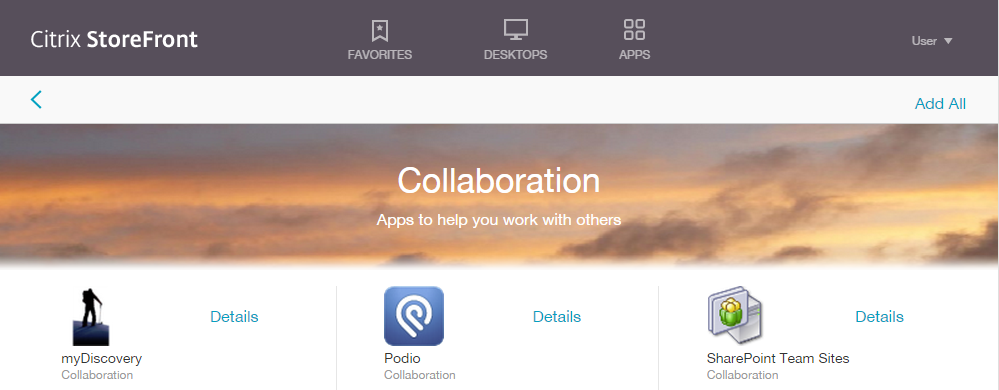
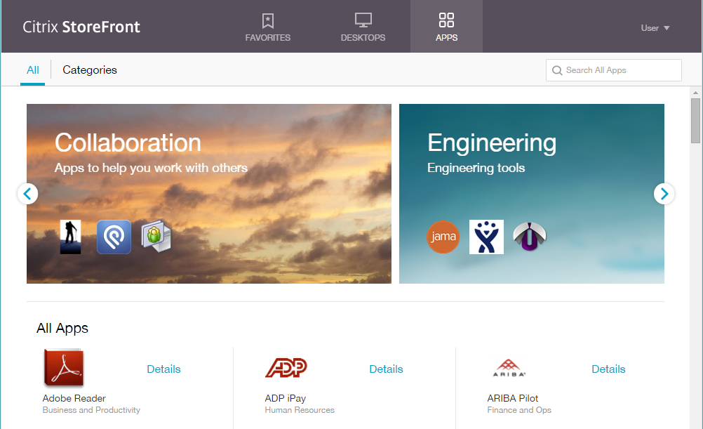
How do I change the background images for the featured categories?
First how not to do it. Don’t try and overwrite the images on the server. If you do change these it will confuse any clients that have already downloaded them, as they won’t know they have changed. It will also make upgrade hard, if not impossible. Instead you can add images of your own to the \custom directory, and add css to reference them. There are two images for each featured category (called bundles internally). The first is shown as a tile in the carousel, and he second as a background image to the header. This second one is stretched to fill the width of the screen and we add a blur to the bottom edge. You can use different images for each screen, or a neat trick is to use the same image but double the background height in the detail page, so that only the top half of the image is shown. As the image is stretched, pick an image for the detail page that looks good if deformed. The first bundle has class ‘appBundle1’, the second ‘appBundle2’ and so on up to appBundle8. Here is a worked example using an image ‘clouds.png’, which you can download from by right-clicking on the image below:
First put the image into the \custom directory (you can download an example from here). The image should be around 520×256 pixels to be consistent with the others (but it will be scaled as needed). Then add the following to style.css:
.appBundle1 {
  background-image: url('clouds.png');
}

.bundleDetail.appBundle1 {
  background-image: url('clouds.png');
  background-size: 100% 200%;
}
Here is what it looks like:
How do I stop my company logo from looking blurry?
The way we handle logos uploaded via the admin tool may be a little counter intuitive, so it is worth a moment to explain.
In essence, we want to handle both regular (‘low DPI’) screens and newer hi-res (‘high DPI’) screens that have a higher number of pixels per square inch. For example, Apple Retina screens are twice the resolution of non-retina screens. On laptops, screens are typically x1.5, x2 or even x3 the “normal” number of pixels for their size. As x2 is by far the most common, and makes the most difference, Receiver has most of its image assets at two resolutions. An image that is 100×100 pixels on a normal screen, also has a ‘x2’ version at 200×200 pixels. This applies to uploaded logos as well.
Now, it wouldn’t make sense to take an uploaded ‘x1’ logo and double its size – we can’t magically add pixels. So, instead the image you upload from the admin console should be a ‘x2’ image – i.e. one double the width and height of the ‘space’ on a regular screen. The ‘space’ is 170×40 pixels, so the uploaded logo should be around 340×80 pixels.
We will then create a second copy of the logo which is scaled to half the size. This is used on low DPI displays. Occasionally this will result in a blurred image, as we have thrown away half the detail. This is rare – especially for logos which tend to be bold and simple – but it can happen.
If you find you have this problem, then the solution is to find two copies of your logo. One at the x1 size and one at the x2 size. You can then edit the custom\style.css to reference the two different images. You should end up with something like this:
<span style="color: green;">/* The following section of the file is reserved for use by StoreFront. */</span>
<span style="color: green;">/* CITRIX DISCLAIMER: START OF MANAGED SECTION. PLEASE DO NOT EDIT ANY STYLE IN THIS SECTION */</span>
<span style="color: green;">/* CITRIX DISCLAIMER: END OF MANAGED SECTION. */</span>
<span style="color: green;">/* You may add custom styles below this line. */</span>

.logo-container {
    background-image: url('mylogo_x1.png');
    background-size: 169px 21px;
}

.highdpi .logo-container {
    background-image: url('mylogo_x2.png');
    background-size: 169px 21px;
}
Note that both specify the same background size. This is because the size is specified in ‘logical’ units – i.e. for the x2 image the size is half the width and height of the actual logo. There is a bug in StoreFront 3.0 that we set the size incorrectly for the x2 variant. We will be fixing this ‘real soon’.
Note these rules are not inside the ‘managed section’ even though they relate to the logo. If you put them there, they will (at best) get overwritten, and at worst will confuse the admin console.
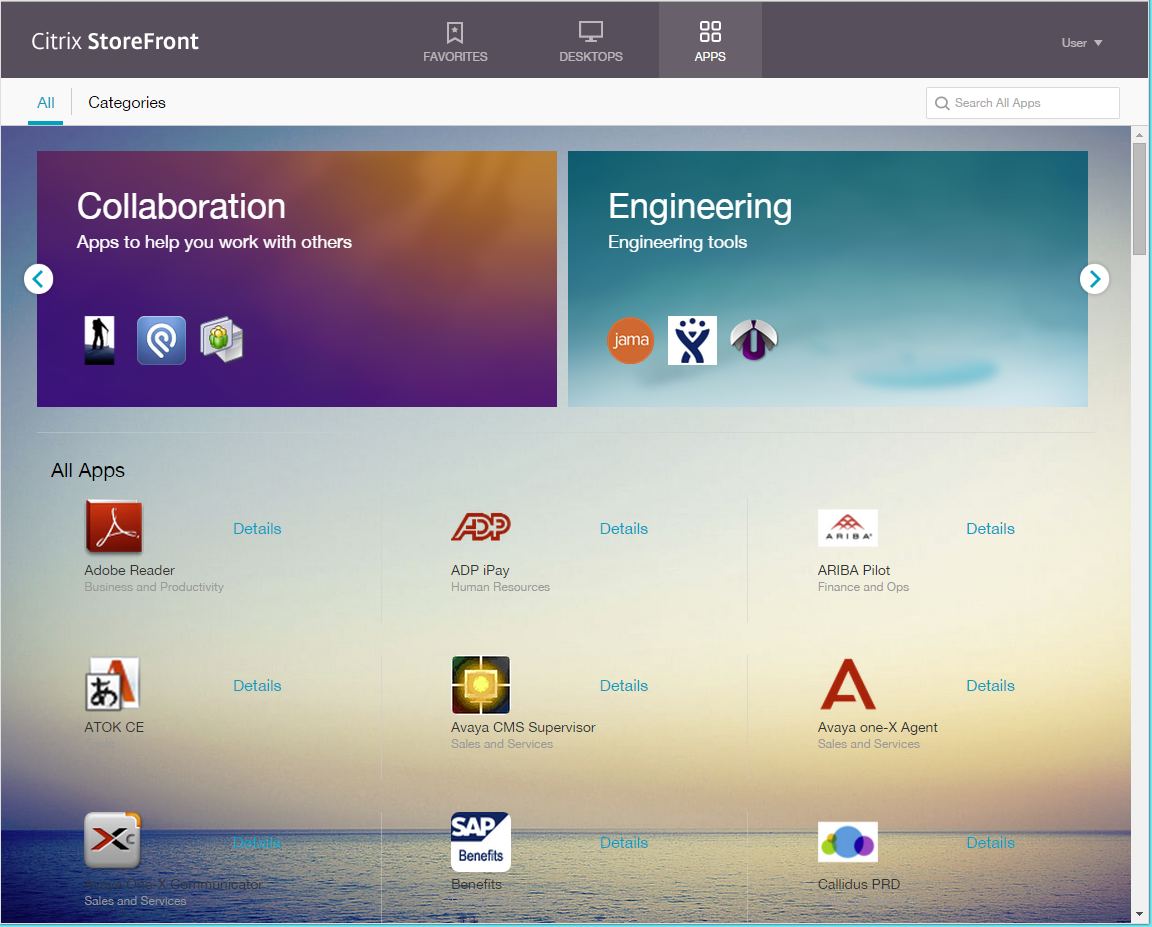
How do I set a background image?
I get asked this question a lot – and I can’t recommend it. The UI is designed for a simple white background. Images tend to make this look rather busy. However, if you really want to, it is possible, but pick an image that is light and not too noisy or take the time to adjust all the fonts to work over a darker image.
Here is a light example:
(Image from https://commons.wikimedia.org/wiki/File:Sea_and_sky_light.jpg)
The code to do this is a simple change to custom.css.
.storeViewSection {
   background: url('images/background.jpg') no-repeat center center fixed;
   background-size: cover;
}
Note that the background-size:cover; statement won’t work in some older browsers.
Here is another variation (hack) for those who have a hankering for the past. No need to upload an image for this one….:
.storeViewSection {
   background: url('../media/bg_bubbles.jpg') no-repeat center center fixed;
    background-size: cover;
    color: white;
}
// Tweak fonts
.smallTiles .storeapp .storeapp-name,
.largeTiles .storeapp .storeapp-name {
color: white;
}// Tweak bundle area so it doesn't clash as badly
.largeTiles .applicationBundleContainer {
background-color: rgba(255, 255, 255, 0.4);
margin-top: 0;
padding-top: 25px;
}
.smallTiles .applicationBundleContainer {
background-color: rgba(255, 255, 255, 0.4);
margin-top: 0;
padding-top: 14px;
}
How do I find errors in my code?
There are several ways to debug.
First always try a browser first – far easier than debugging customizations in a native receiver. Normally, we try to suppress any errors that might occur in your (or our) code, but you can highlight them instead. Adding #-errors to the page URL will give an alert box when an error occurs – and adding #-debug will disable any exception handling for customization code. This can be useful if you are using the development tools built into modern browsers (For example F12 in Chrome or IE) and want to debug the exceptions yourself.
A third option #-nocustom will disable your script and css customizations. This is useful if Receiver isn’t working, and you want to find out if it is due to an error you have introduced.
Finally, a power user option is #-tr. This provides tracing of the Receiver UI code in a separate browser tab – and this will include any tracing you add with calls to CTXS.ExtensionAPI.trace().
All these arguments can be used after the ? or # in the page URL, and you can string several together. For example:
http://storefront.wwco.net/Citrix/StoreWeb/#-tr-nocustom
I hope the recipes in this blog prove useful. I’ve had a few requests that are beyond the scope of the current customization APIs – and I’ll be looking to add a few more APIs to help out with those – but hopefully this blog has covered the majority of common scenarios. If there are still gaps and/or your are struggling with making changes you need, please comment below.
Blogs in this series


